Think Outside of the Slide
- by gmashworth
- in Design
- posted March 15, 2018
Businesses often invest heavily in branding materials like brochures, annual reports, and advertising. But when it comes to presentations, the same attention to design is rarely applied. Instead, these are often created in-house by employees, despite the high stakes they sometimes carry.
Millions of people use Microsoft PowerPoint regularly for training, business pitches, and conferences. Yet, most use it ineffectively, relying on outdated templates and overused visuals. PowerPoint has evolved since its early days in the 1980s, but how people use it often hasn’t.
“The same old tricks that once charmed the audience and got them leaning forward in their seats could now have them rolling their eyes, heaving heavy sighs and reaching for their phones to tune out entirely.” — Michelle Panzironi, Marketing Manager
In my corporate days, I spent years urging teams to simplify their decks—cut down on wordy slides, reduce charts and tables, and make things more visual. My advice often fell on deaf ears until an external consultancy echoed my recommendations during sales training. Only then did attitudes shift. Why? Because sellers noticed real improvements in audience engagement.
PowerPoint isn’t the problem—it’s just a tool. A hammer doesn’t build a house, and software doesn’t tell compelling stories; the presenter does.
“PowerPoint is a tool; it isn’t content. Microsoft Word doesn’t tell beautiful (or awful) stories, the author does.” — Dr. Curtis Newbold, Visual Communications Expert
What makes a presentation ineffective?
Too much text. Bullet point overload. Unreadable tables. Slides like these hinder communication and bore the audience. Worse still is the all-too-common habit of reading from the slides, often while standing in front of them. This disconnects the speaker from the audience and defeats the purpose of visual storytelling.
The slide is not the speech
Slides should support the story, not be the story. Yet, many presenters treat them as teleprompters. People read faster than they listen, so they often zone out while waiting for the speaker to catch up. Stand to the side. Let your voice guide, and let the visuals reinforce.
The Real Visual Offenders
Some of the worst habits:
- Tiny fonts squeezed into crowded slides
- Excessive bullet points and sub-points
- Tacky clipart and outdated graphics
- Unnecessary animations and effects
Instead, use:
- Clean, bold layouts
- Relevant visuals (photos, infographics, icons)
- White space for clarity and focus
- Avoid stock photos that look staged and clichéd. Choose images that feel authentic, emotional, and on-brand.
Design is communication
Design isn’t about decoration; it’s about clear communication. Simplifying slides is not dumbing them down—it’s making them more accessible, digestible, and memorable.
Hiring a professional graphic designer may seem like a luxury, but it’s an investment—especially for high-stakes presentations. For more on pricing, see Is Graphic Design Expensive? and The Design Brief.
Clients who want to work with me must be open to a new approach. I don’t use Microsoft software for design; I use professional tools to ensure high-quality visuals. Just as you wouldn’t ask for editable business card files, presentations should be treated with the same standard.
Need to include complex data? Create a supplementary handout. Provide deeper detail in a printed or digital booklet. Keep the slides simple and visually driven.
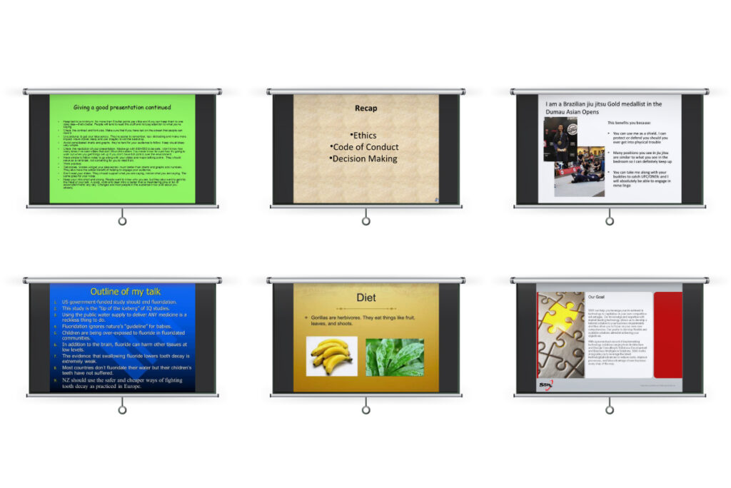
Examples that work
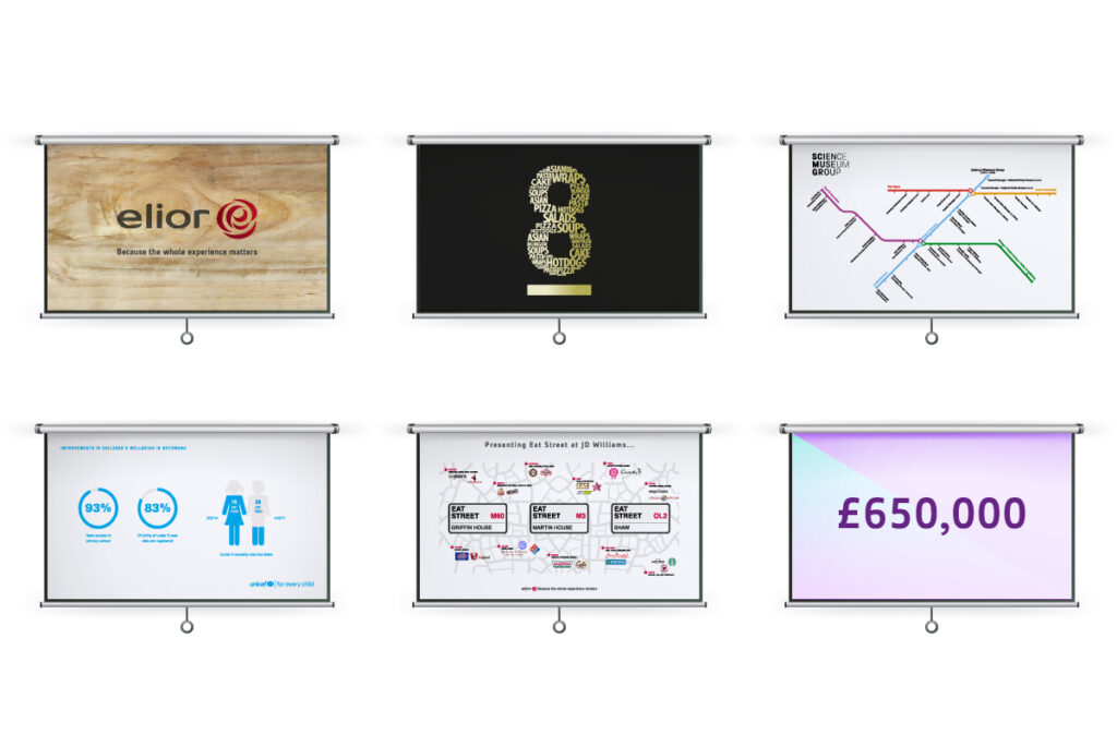
Slide Descriptions:
- Intro Slide: No name or job title. Just the brand.
- Identity Concept: A word cloud in the shape of a logo communicates the idea clearly.
- Org Structure: A map-like layout for a transport museum.
- Visual Stats: Data presented through design, not tables.
- Location Map: A visual for a hospital-based food concept.
- Profit Figure: One strong number backed by financials elsewhere.
Cut the Edits
Slides often go through endless revisions. Visual presentations reduce this by making messaging clearer and less reliant on rewrites. Spoken notes can change—your slides don’t have to.
Think of Slides Like Ads
A presentation is a sequence of mini-billboards. No billboard tells you everything. It delivers one clear, strong message. So should your slides.
Final Thought
If your presentation matters, then how you present it should matter too. Think outside of the slide. Design with purpose. Speak with clarity. Respect your audience’s time.
And please, ditch the excessive bullet points.
Comments
Alma
April 6, 2018 at 8:39 pmHello. This is a very well written article, thanks for the post. I’ll definitely comeback.
Ralf
September 12, 2018 at 4:07 pmVery educational, thanks.
Jocelyn
September 22, 2018 at 11:36 amIf anyone wants an expert view concerning graphic design, I will recommend they visit this website. Poursuivre ce qui est commencé.